Showing posts with label Bartek Walczak. Show all posts

Friday, 21 January 2011

Evaluation: Question 2


The digipak shows a clear visual link with the advertisement as both use the same font and colour scheme throughtout. Dark backgrounds also feature in the digipak and advertisement which is a direct comparison to our music video where we chose to have a dark setting.


The theme which was the use of purple, black and white is also visable within the ancillary products. The sinister feel that we went for seems to suit the targeted audience which was mainly people ages between 16-25 who have an interest the genre - grime/drum n' bass. The digipak will definately attract audience as it looks appealing and suits the genre criteria. 


The album cover and advertisement stand out as they both have large images which emphasise the importance of the artist, the light clothing makes it more visable on a dark background theme that I chose to use. 


Another factor that has a direct link to the music video is the Tower Bridge image which is used for the advertisement as there are elements of footage that are located in the same area. This convention was used to intentionally show that our main character shot against a city background 'rules the city'. 

Another factor that has a direct link to the music video is the Tower Bridge image which is used for the advertisement as there are elements of footage that are located in the same area. This convention was used to intentionally show that our main character shot against a city background 'rules the city'. 


Wednesday, 19 January 2011

Evalation: Question 4


Feedback & Analysis of Music Video


Feedback that we recieved for our music video highlights two main points that we could have improved. These were: the pace of our editing wasn't quick enough at different points and the lip-sync was just out in some parts. The answer to this problem would be shoting in more location with more footage, this would enable us to make our cuts more dynamic. Lighting - where most feedback recieved showed us that it was dark in places, to solve this problem we could have used extra lighting.

Feedback on Ancillary Products


The ancillary products feedback recieved indicated that there was a clear use of the same font and colour (purple) throughtout my digipak and advertisement. He also believed that my digipak matched Lupe Fiasco's album cover, this outcome showed that I was inspired by Lupe Fiasco's cover.

Saturday, 15 January 2011

Evaluation: Question 1

 Evaluation Question 1

Our final choice of a music video that inspired us was Tinie Tempah: Pass Out. This decison was made on the basis that it suited our grime/drum n' bass theme that we focused on. The dark setting that matches the genre was something that influenced us, we also decided to use this feature in our video with different angle shots of the artist.


Challenging the conventions of the genre was something that we decided to do, as our inspired video mostly consisted of the artist on a black background. Some of our footage was shot at London Bridge on a city landscape this was our way of making it different, however we still managed to our plan which was to keep the dark scenery as it was filmed in the evening.


Both of these images have similarities, the background and lighting is a factor that influenced us and it also matches the genre of the video which is grime/drum n' bass.


Lupe Fiasco's album cover influenced me in the following ways: the use of a stared background theme with the use of purple and other colours was ideal to suit the genre of a typical grime video where the surrounding is usually dark. The dark theme also links between my album cover and elements of the video. The font also inspired me to use something similar as it links to the genre of grime/drum n' bass.

There is a clear link between N'Krypt's album cover and Lupe Fiasco's, the use of purple throughout both of the album covers can be seen, although Lupe Fiasco's only has hints of purple it's visual match seems to suit the genre well. Whereas in N'Krypt's it's mostly the text and the thank you inside cover. The colour scheme & font was used throughtout the digipak and the advertisement. The convention of a stereotypical dark setted grime music video was also kept within the digipak and advert, I chose to stick images with dark background as it relates to our video: setting wise.


The convention of a stereotypical dark setted grime music video was also kept within the digipak and advert, I chose to stick to images with dark backgrounds as it relates to our video and genre: setting wise.

Monday, 13 December 2010

Digipaks (Planning)

Our group has decided to go for a space theme as our background, with the use of purple and black as our main colours throughout our digipak. Giving it an overall dark authentic look as we feel it suits our genre. The album cover above influenced us to come up with such an idea and seems appropriate for our hip-hop genre.

 Some of our track names that we have chosen are: 
  • Sky's the limit
  • Finesse
  • More money more problems


Analysis of 3 Digipacks


Kid Cudi's album cover is one that hints to the audience what genre his music which is Hip-Hop. This album cover relates to our genre as we also focused on a hip-hop genre within our music video. Our targeted audience is also similar to the one of Kid Cudi's as it focuses on a teenage audience which have a high interest in this type of music. The font on the album cover is similar to the one I would like to use, as it seems to suit this type of genre. The image on the cover as you can see is a picture of Kid Cudi's with the back of his head being the moon, this related to the name of the album which is 'Man on the Moon'.


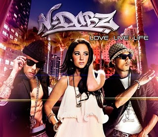
N-Dubz' album cover also has a similar genre in comparison with ours. The city background in the cover relates to our theme as similar ideas where developed during our video and city scenes also featured in our music video. The colour scheme which is mostly purple is another factor that matches the description of what colours I'd like to use in my digipak. The audience is also roughly the same as our music video which targets mainly teenagers a this is where the genre is most common.


Lupe Fiasco's album cover is another example which is similar to ones above, the colour scheme and font which are quite unusual. The font is in a sort of arabic form as it relates to one of this tracks. The background is a factor that really interests me and I'd like to use something along the lines of it with stars in the background. The audience is also based among teenagers.


Wednesday, 1 December 2010

Research of Album covers


These are the various ideas for  our Digipak, the theme is dark, midnight colours and with space as an emphasis for our final Digipak and Advertisment. 


Saturday, 20 November 2010

Monday, 11 October 2010

Short-List of Potential Songs

Our first choice was Logic - The Future. The genre didn't really suit our liking and we decided to look at other potential videos and genres.


However, after discussions between our group we had two songs in mind Tinie Tempah - 'Frisky' and 'Pass Out'.


Our final decision came to Tinie Tempah - 'Pass Out'.

Wednesday, 6 October 2010

Vladimir Propp's - Applied Theory


Vladimir Propp was born on April 17, 1895 in St. Petersburg to a German family. He attended St. Petersburg University (1913–1918) majoring in Russian and German philosophy. Upon graduation he taught Russian and German at a secondary school and then became a college teacher of German.


Both of these videos present Vladimir Propp's theory through the hero/villain. In 50 Cents's 'Get Up', 50 Cent is portrayed as a hero, saving a female character from danger. The whole story is visible throughout the video.

Proop concludes that all the characters could be resolved into 8 broad character types:


- The villain — struggles against the hero.
- The donor — prepares the hero or gives the hero some magical object.
- The (magical) helper — helps the hero in the quest.
- The princess or prize — the hero deserves her throughout the story but is unable to marry her because of an unfair evil, usually because of the villain. the hero's journey is often ended when he marries the princess, thereby beating the villain.
- Her father — gives the task to the hero, identifies the false hero, marries the hero, often sought for during the narrative. Propp noted that functionally, the princess and the father can not be clearly distinguished.
- The dispatcher — character who makes the lack known and sends the hero off.
- The hero or victim/seeker hero — reacts to the donor, weds the princess.
- False hero — takes credit for the hero’s actions or tries to marry the princess.

Analysis of Target Audience

Our target audience is mainly teenagers aged from about 16-24 year olds.

Kevin Garcia is a Latino from Colombia who lives in Seven Sisters, North London. Kevin is 17 years old and has just completed his first year at college and has just started his second year. He works part time at Selfridges and receives £8.00 an hour. He enjoys playing football and working out in the gym. As a typical teenager, his means of travel is his Oyster card and uses public transport regularly. Kevin owns a blackberry and when he's at home, his entertainment is his PS3 where he plays his friends online via the internet. He also owns a laptop which he uses for socialising with his friends. In terms of clothes, he is attracted to big brands such as Ralph Lauren, Lyle & Scott, True Religon etc. He also sports the smaller brands such as Nike, Adidas. Moreover, he purchases his clothes at his workplaces where he receives a staff discount.

He enjoys partying almost every weekend and usually ends up drunk after a good night out. He enjoys dance music, electro and drum n bass, as well as hip hop, grime and RnB. Tinie Tempah's 'Pass Out' is one of his favourite songs as it has genres of hip hop but drum n bass incorporated into it. Kevin first heard of the song whilst on holiday at Ibiza where Tinie Tempah held a concert in the summer.


Monday, 4 October 2010

Video Analysis - Dizzee Rascal: Holiday


The narrative in this video is clearly based around women, the video itself and the lyrics emphasise this fact. Both of these factors match eachother, meaning that the lyrics are about what goes on in the video. There is a direct link between the narrative and the lyrics. The genre could be a mix of pop and electro. The media language in the video is at a high standard. The cuts match every beat in the video, the bright lighting, holiday style scenery match the lyrics. The representation of this clip is that there are females who are only in bikini's whereas the main character Dizzee Rascal is fully clothed up. The camera also tends to focus on female body parts using slow motion. 

Wednesday, 29 September 2010

Requesting Copyright Permission - Letter


Parlophone Records           
Keith Wozencroft
43 Brook Green
London
W6 7EF
United Kingdom


Dear Mr. Wozencroft,

I am writing to inform you about a possibility to request permission to use Tinie Tempah's track - Pass Out for our media project. We a group of students from City and Islington Sixth Form College based in North London, we will be working to produce a promotional package for the release of a new album track. The finished project will NOT be made available publicly and will be used solely for coursework purposes. The holder of the original copyright will be fully acknowledged in the finished project. If you do not hold the rights for these songs, I should be very greatful if you could forward this request to the appropriate person, or reply to me with the contact details in order that I might approach the copyright holder directly.

Yours Sincerely,

Bartek Walczak

Lip Sync Tutorial


During the process of lip syncing we should have made our shots more complex and developed our editing to a higher standard. Our main challenge was for Neto to change his style in front of the camera from the thriller which we did last year to a more confident and straight-up character who was willing to sing in front of a camera.

We learned to how use various tools such as the razor blade and markers. This helped us develop our knowledge of the program to a larger extent. The difference between editing the thriller in comparison to the music video is that we have to use a more variety of shots, more complex editing as well as matching the sound track to Neto's lips.