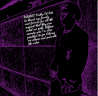
The digipak shows a clear visual link with the advertisement as both use the same font and colour scheme throughtout. Dark backgrounds also feature in the digipak and advertisement which is a direct comparison to our music video where we chose to have a dark setting.
The theme which was the use of purple, black and white is also visable within the ancillary products. The sinister feel that we went for seems to suit the targeted audience which was mainly people ages between 16-25 who have an interest the genre - grime/drum n' bass. The digipak will definately attract audience as it looks appealing and suits the genre criteria.
The album cover and advertisement stand out as they both have large images which emphasise the importance of the artist, the light clothing makes it more visable on a dark background theme that I chose to use.
Another factor that has a direct link to the music video is the Tower Bridge image which is used for the advertisement as there are elements of footage that are located in the same area. This convention was used to intentionally show that our main character shot against a city background 'rules the city'.
Another factor that has a direct link to the music video is the Tower Bridge image which is used for the advertisement as there are elements of footage that are located in the same area. This convention was used to intentionally show that our main character shot against a city background 'rules the city'.


No comments:
Post a Comment