Monday, 17 January 2011

Evaluation Question 2

QUESTION 2: HOW EFFECTIVE IS THE COMBINATION OF YOUR MAIN PRODUCT (VIDEO) AND ANCILLARY TEXTS (DIGIPAK AND ADVERTISMENT)?


This album cover by Sam Sparro, an Electro-House artist, shows only two colours involved in the artwork, black and gold; the name of the album being "Black and Gold" shows that there is a synergy between the name of the album along with the colours that the consumer will see. This feature of the album cover didn't appeal to me as much for my own work, however I did decide to use a similar Bold font that Sam Sparro has used. This proves to be a distinctive, so I decided to use the font "Impact" in Photoshop, this was not only chosen for appearance, but an eye-catching font which any consumer could easily recognise. 


This is another album cover which has influenced me in the production of my Digipak. The duo "Locnville" also used  a purple/pink theme which in a stereotypical view would be seen as a "feminine colour", it shows us here that purple and pink can be used on a wide range of genres. 
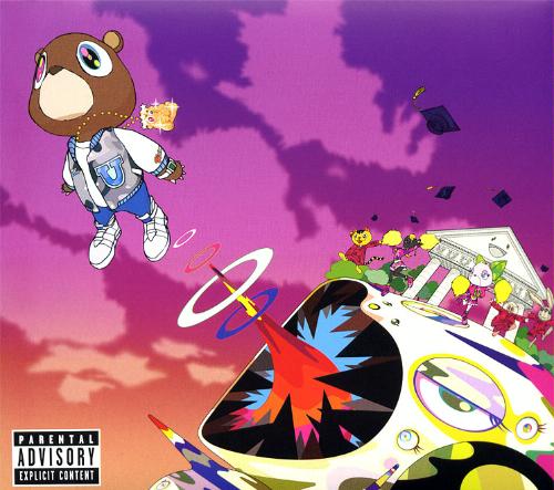
Hip Hop heavyweight Kanye West showed that the uses of cartoons, graphical images and the vast use of purple/pink,  defies any stereotypes...


Another hip hop star, Cam'ron, uses purple as a main theme for his album cover. This was actually the first inspiration for my Ancillary print product, the mise-en-scene of New York city proved pivotal for me as I easily recognised it, as many others would too. In addition, my use of Tower Bridge was used for this same reason, as a worldwide icon it was easily recognised.


Evaluation Question 1

QUESTION 1: In What Ways Does Your Media Product Use, Develop Or Challenge Forms And Conventions Of Real Media Products?


Tinie Tempah's "Pass Out" was the immediate backbone/theme for our music video, without imitating every single shot and directly copying the video, we decided to use the theme of a dark setting in various shots to reminesce the video so the audience would see this resemblance from the original video. This is one of the scenes whereby Neto is standing behind a black backdrop with a spotlight, similar to that of Tinie Tempah who is standing in a black room with a single spotlight.


The tracking shot of Kid Cudi's video "Memories" shows a tracking shot in various scenes which makes the video slightly more dynamic, we decided to use this concept in our video but for a shorter period and to also add a dynamic edge to our video instead of being static throughout.


The Stencil effect that Kid Cudi has used in his advert is something which I incorporated into one of my inside panels. Kid Cudi decides to use a head his head as the front cover of his album but the similarity may not be exact on the advert, however, the skull can easily be recognised as Kid Cudi's head. 


Tower Bridge used as the main background image as one of the main scenes were filmed in front of this backdrop.

Using the Front Cover of my album as the main emphasised into my advert purely so there can be a link between both the Digipak and Advert. 


Tinie Tempah's other hit "Frisky" was a video which we were influenced by, this time for the camera shots and angles used. These two screenshots show Tinie Tempah slightly crouched and looking into the camera from a low angle. Most videos of this genre use this camera style to show the artists "dominance" and "authority"; as most artists of this genre pride themselves on status and wealth, this could be a direct representation of both these things.

This is also shown here in Skepta's video "So Alive"


The video "Signs" by Justin Timberlake ft Snoop Dogg directly reflects what our own video is like. The laid-back and dark atmosphere represents most grime/hip hop video concventions in general. Our own video is quite similar to Timberlake's because as a dancer, he chooses to add his own style and put in  a performance into the music video. We have successfully done this too as we used one of the group members dance group to perform in our video. There street-dance style was used in our video to typify what the hip-hop genre is about, and in many cases, this is dancing and having a good time.

Justin Timberlake showing off a dance move, and, below, a shot from our very own dance scene.

Justin Timberlake influenced us because we wanted to add a sense of rythm and flair into the video, this was expressed through the dancing and break-dance moves.

Saturday, 15 January 2011

Evaluation: Question 1

 Evaluation Question 1

Our final choice of a music video that inspired us was Tinie Tempah: Pass Out. This decison was made on the basis that it suited our grime/drum n' bass theme that we focused on. The dark setting that matches the genre was something that influenced us, we also decided to use this feature in our video with different angle shots of the artist.


Challenging the conventions of the genre was something that we decided to do, as our inspired video mostly consisted of the artist on a black background. Some of our footage was shot at London Bridge on a city landscape this was our way of making it different, however we still managed to our plan which was to keep the dark scenery as it was filmed in the evening.


Both of these images have similarities, the background and lighting is a factor that influenced us and it also matches the genre of the video which is grime/drum n' bass.


Lupe Fiasco's album cover influenced me in the following ways: the use of a stared background theme with the use of purple and other colours was ideal to suit the genre of a typical grime video where the surrounding is usually dark. The dark theme also links between my album cover and elements of the video. The font also inspired me to use something similar as it links to the genre of grime/drum n' bass.

There is a clear link between N'Krypt's album cover and Lupe Fiasco's, the use of purple throughout both of the album covers can be seen, although Lupe Fiasco's only has hints of purple it's visual match seems to suit the genre well. Whereas in N'Krypt's it's mostly the text and the thank you inside cover. The colour scheme & font was used throughtout the digipak and the advertisement. The convention of a stereotypical dark setted grime music video was also kept within the digipak and advert, I chose to stick images with dark background as it relates to our video: setting wise.


The convention of a stereotypical dark setted grime music video was also kept within the digipak and advert, I chose to stick to images with dark backgrounds as it relates to our video and genre: setting wise.

Thursday, 13 January 2011

Evaluation question 1

Evaluation question 1


This was the basis of our music video, it was what we were most influenced by although it does not mean we didn't challenge the forms of convention of this genre in one way or another.What we used similar to do this music video was the fact that the back ground where the artist mainly sang was darkish we were also inspired by the creativeness of the music video for example the way the texts would pop up in the music video while the artist was singing. Also ofcourse it was the idea for the orginal song that we decided to go with came from.


Another video that also played an infuential part in our music video was David Guetta's music video 'Memories' me and my group wanted to take most advantage of the tools that we were gifted in particular the camera angles and one that stood out for us in particular was the tracking shot we searched for which artists used it well and we came to the conclusion that David Guetta used it essentially well when he was singing and walking at the same time .below is his music video, which we mirrored his tracking shot technique in our own video.


Also below is where we use a tracking shot  in Our music video in the London Bridge scene at 2 minutes and 22 seconds.


The Digipak i made is very conventional especially with the mise en scene, the clothing really suits our genre, urban/drum and bass'. 
The advertisement was also very conventional with the font and sizes of the font and also the colour scheme was done to great effect.

we also fairly stuck to the conventions of the genres of our music video however we also challenged it in some area for example near the beginning of our music video we have a comical gesture  in an otherwise quite serious music video.


In relation to the pace of the editing in our music video i took inspiration from artists such as ice cube in his music video 'you can do it' also usher in the performance presence that he displays through his music videos.