Tuesday, 14 December 2010
Monday, 13 December 2010
Digipaks (Planning)
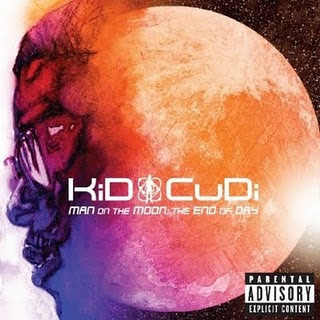
Our group has decided to go for a space theme as our background, with the use of purple and black as our main colours throughout our digipak. Giving it an overall dark authentic look as we feel it suits our genre. The album cover above influenced us to come up with such an idea and seems appropriate for our hip-hop genre.
Some of our track names that we have chosen are:
- Sky's the limit
- Finesse
- More money more problems
Analysis of 3 Digipacks
 Kid Cudi's album cover is one that hints to the audience what genre his music which is Hip-Hop. This album cover relates to our genre as we also focused on a hip-hop genre within our music video. Our targeted audience is also similar to the one of Kid Cudi's as it focuses on a teenage audience which have a high interest in this type of music. The font on the album cover is similar to the one I would like to use, as it seems to suit this type of genre. The image on the cover as you can see is a picture of Kid Cudi's with the back of his head being the moon, this related to the name of the album which is 'Man on the Moon'.
N-Dubz' album cover also has a similar genre in comparison with ours. The city background in the cover relates to our theme as similar ideas where developed during our video and city scenes also featured in our music video. The colour scheme which is mostly purple is another factor that matches the description of what colours I'd like to use in my digipak. The audience is also roughly the same as our music video which targets mainly teenagers a this is where the genre is most common.
Lupe Fiasco's album cover is another example which is similar to ones above, the colour scheme and font which are quite unusual. The font is in a sort of arabic form as it relates to one of this tracks. The background is a factor that really interests me and I'd like to use something along the lines of it with stars in the background. The audience is also based among teenagers.
Friday, 10 December 2010
Analysis of Advertisement
This is an an advertisement i analysed from Tinie Tempah, i found analysing this artist ideal especially because my coursework originated from this artist. In this poster advertisement you can see that the font is all the same and the colour scheme and design represents the artist's music genre which is techno/pop.
Another artist that i analysed was 'Omarion' in this advertisment of his album called 'Ice Box' there is a revelevance between the image on the front cover and the bass storyline of what he sings about it is not instantly clear to which genre this artist belongs to but through the mise en scene that you can see in his clothes you can get an indication that this artist is an R&B styled singer.
Below is an example of one of 'Omarion's songs which coincidentally also has the same name as the album.
The final artist advertisement that i analysed was from the artist 'Daft Punk' the name gives away the genre style which is punk/house music and the font corresponds perfectly with the genre. This alongside with the colour scheme is an attention catcher and will help pull in many sales.
Thursday, 9 December 2010
Analysis of Digipaks
'The Game' created a song called "Dreams", whereby he recalls a moment in his life and his rise to fame in this song. The album cover for 'The Documentary' shows him sitting on two gold wheels. This is shown in the video, so for a viewer, they would be easily able to recognise his album from watching the video, or the other way round.
This album cover, by "Madvillain", shows him wearing this metal mask, which is something we immedietly notice. His name sounds like that from a comic book/novel; which reiterates why he has a mask on. His video 'Rhinestone cowboy', shows him wearing the mask throughout, again making it easier to recognise who this artist is because of the distinctive feature which is the mask.
Analysis of Advertisments
This was the song chosen for our music video, Tinie Tempah's "Pass out". The original video is set in a dark, low-lit atmosphere, which was, at times, found in our own video. This darkness is carried over in this advertisment, showing a pitch black background which is literally found throughout the Original "Pass out" video. The audience we've targetted, are mainly teenagers and young adults, so the use of font will be important so it may appeal to this particular audience.
This is the advertisment for Kid Cudi's "Pursuit of happiness". This also appeals to the teenage/young adult audience because it is a trip-hop song, which is a twist of hip-hop and electro beats, all which appeal to the youth of today. This advertisement shows a purple skull which is very similiar to the front cover of the "Man On The Moon" album by Kid Cudi, which shows Kid Cudi's head facing in the same position as the skull above. The color scheme is important as orange and purple are both similar, illuminous colours which work well with eachother. This is something I may incorporate into my own advertisment and Digipak. The black theme on this is another aspect which I will focus on as its an effective base layer for midnight colours. The advert, however, doesnt relate in any way to the actual music video, so people wouldnt know much about the video until actually watching it.
This advert for Lupe Fiasco's "Superstar", also has no relevance to the actual music video. Lupe's main calliagraphy of his name in the centre, was created to mimick the Arabic language, when in fact it is english. This isnt something I would use personally, because it seems over-complicated and I think for a new artist to rise, most things such as font should be kept simple to gain recognition easier. The night/space sky is something I want to use for my Digipak and maybe my advertisment to portray the genre in a sinister, but positive way.
Monday, 6 December 2010
Analysis of 3 Digi paks
The first digi pak that i decided to analyse was a digipak from an artist that i have previously worked on and that is the digipak of Usher Raymond.
This album cover perfectly illustrates the genre of songs which usher sings which is R&B we see this through his mise en scene in the clothes that he is wearing. Furthermore in the beautiful girls that are surrounding him.
Another digipak i analysed was one from the artist 'Ne-Yo' immediently what draws the viewer in is the contrast in font size and the fact that all the letters are in capital also helps draw in customers. With this particular digipak is hard to distiguish the genre straight away but from the top of my head i would say this is urban music i get this indication from the style of hat the artist is wearing and also the colours involved in the digipak.
This album cover perfectly illustrates the genre of songs which usher sings which is R&B we see this through his mise en scene in the clothes that he is wearing. Furthermore in the beautiful girls that are surrounding him.
This the music video to which the album cover goes to and in the video you can see the relation between the digi pak the musicvideo and the genre of the song.
Another digipak i analysed was one from Daft punk in this Digi pak it is more font than image that gives the viewer an indication for which genre this belongs to, and through my research i have come up with the genre of techno, this is a vaguely fast up tempo genre.
Another digipak i analysed was one from the artist 'Ne-Yo' immediently what draws the viewer in is the contrast in font size and the fact that all the letters are in capital also helps draw in customers. With this particular digipak is hard to distiguish the genre straight away but from the top of my head i would say this is urban music i get this indication from the style of hat the artist is wearing and also the colours involved in the digipak.
Wednesday, 1 December 2010
Research of Album covers
These are the various ideas for our Digipak, the theme is dark, midnight colours and with space as an emphasis for our final Digipak and Advertisment.
Subscribe to:
Comments (Atom)


